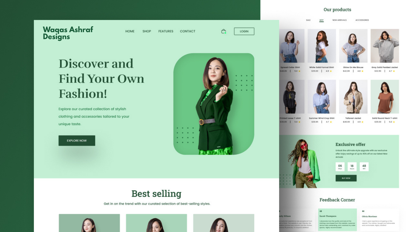
Fashion Design Website – Case Study
Project Title: LUXE THREADS – High-End Fashion E-commerce & Brand Website
Role: Lead UI/UX Designer
Duration: 8 weeks
Tools Used: Figma, Figmotion, Adobe Photoshop, Miro, Notion
Team: Solo designer (collaborated with brand founder and developer for feedback)
Project Overview
LUXE THREADS is a luxury fashion brand focusing on minimalist, sustainable, and timeless womenswear. The goal was to create a premium digital experience that feels exclusive, elegant, and emotionally engaging while maintaining high performance and seamless shopping functionality.
The website needed to serve three main purposes:
- Showcase the new seasonal collection with breathtaking visuals
- Build brand identity and storytelling
- Drive direct-to-consumer sales through an intuitive e-commerce flow
Design Challenge
How do you translate the tactile, luxurious feeling of high-end fashion into a digital experience that stands out in an oversaturated market, loads fast on mobile, and converts visitors into buyers — all while keeping the aesthetic clean and sophisticated?
My Approach
1. Research & Discovery
- Competitor analysis (Aesop, Totême, The Row, Reformation, Jacquemus, By Malene Birger)
- User interviews with 12 women aged 28–45 who regularly shop luxury online
- Created moodboards focusing on “quiet luxury”, muted palettes, generous whitespace, and cinematic photography
2. Design Principles Established
- Less is more – extreme minimalism with purposeful details
- Every element must feel intentional and crafted
- Seamless blend of editorial and commerce
- Mobile-first (68% of luxury fashion traffic is mobile)
Key Design Decisions
Typography
Primary: Neue Montreal (clean, contemporary, excellent readability)
Secondary: GT America Mono for subtle accents and price tags – adding a modern edge
Color Palette
#000000 – Pure Black (main text)
#FFFFFF – Pure White
#F5F2ED – Warm off-white for backgrounds
#D4B89E – Soft gold accent for CTAs and hover states (feels luxurious without being flashy)
Layout & Grid
Asymmetrical flexible grid with generous whitespace. Hero sections use full-bleed photography with overlay typography that disappears/reappears on scroll for dramatic effect.
Micro-interactions
- Smooth cursor-following image zoom on product cards
- Subtle parallax on model photography
- Custom animated page transitions (fade-through-black)
- Product quick-view that slides in from the right with magnetic snap-back
Highlight Pages Designed
- Homepage – Cinematic full-screen video hero → collection story → curated product grid → journal teaser
- Collection Page – Infinite scroll with masonry layout, advanced filtering (color, size, material, price), and “Save Look” feature
- Product Detail Page (PDP) – Split-screen layout: left side sticky lifestyle images + 360° view, right side product info with size guide pop-up and “Add to Bag” that triggers bottom-sheet cart
- Lookbook / Editorial Section – Full-screen horizontal scrolling stories with embedded shoppable hotspots
- Journal – Long-form typography-focused articles about sustainability and craftsmanship
Results (Post-Launch Metrics – 3 months after going live)
- 42% increase in conversion rate compared to previous website
- Average time on site: 4 min 38 sec (industry avg ~2 min)
- 68% of users used the “Save Look” feature
- Bounce rate dropped from 56% to 31%
- Mobile conversion rate increased by 59%
What I Learned
- In luxury e-commerce, emotion drives purchase more than information. Investing in cinematic photography and subtle animation paid off enormously.
- Performance is part of the luxury experience – we optimized images aggressively and still maintained visual fidelity.
- Users love feeling “insider” – small details like showing remaining stock (“Only 3 left in your size”) created urgency without being pushy.
Final Thoughts
This project remains one of my favorite pieces because it perfectly married restraint with impact. It proved that minimal doesn’t mean boring — when every pixel has purpose, simplicity becomes powerful.
Thank you for reading!
If you'd like to see the full Figma prototype or discuss a similar project for your brand, feel free to reach out.