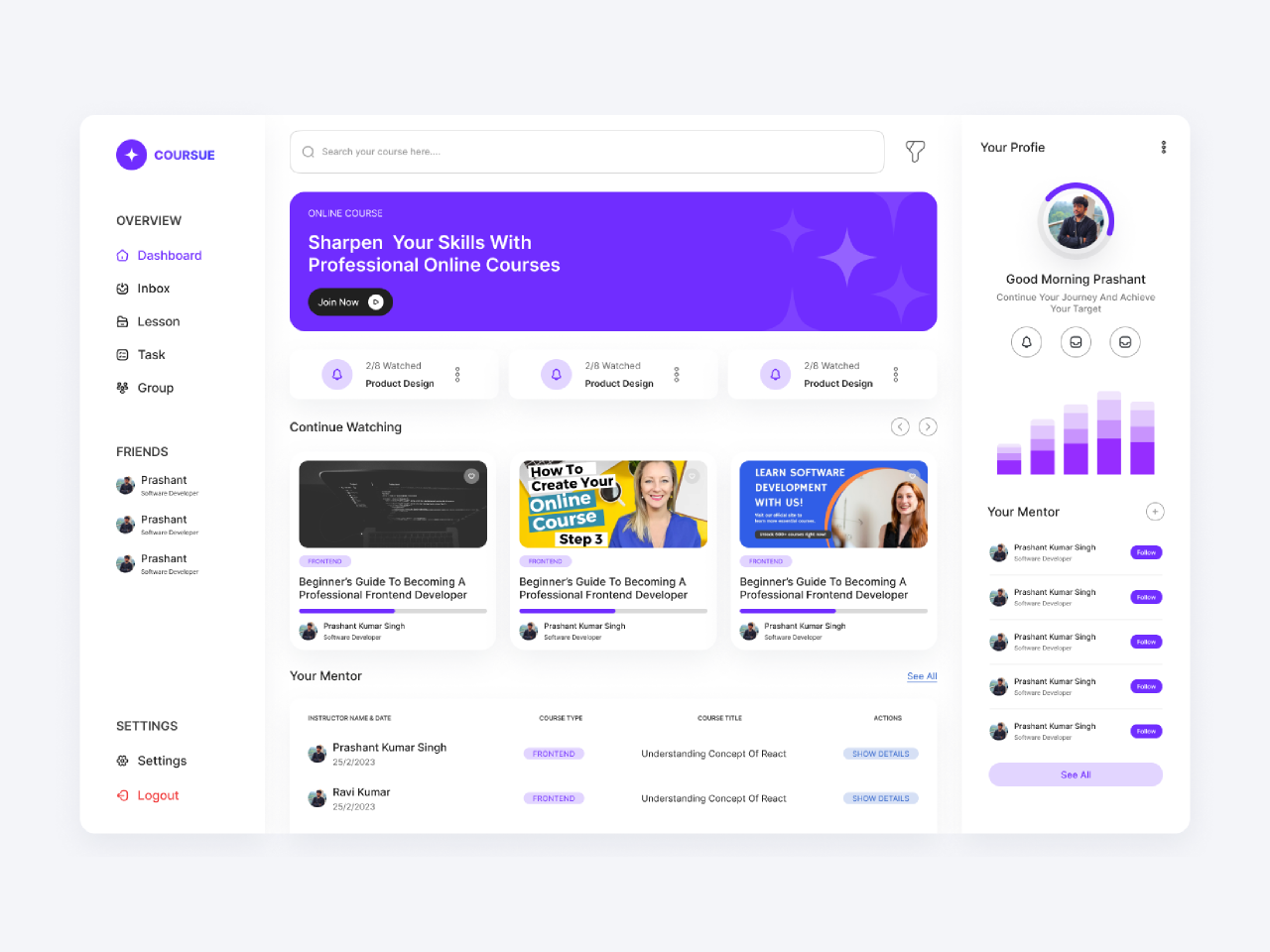
Online Courses Dashboard – Case Study
Project Title: LearnFlow – Modern Online Learning Platform Dashboard
Role: Lead UI/UX Designer
Duration: 4 weeks (2024)
Tools Used: Figma, Figma Variables & Auto Layout, FigJam, Miro, Notion
Platform: Web (Responsive) + Tablet
Project Overview
LearnFlow is a comprehensive online education platform that connects learners with thousands of courses across multiple categories. The main challenge was to redesign the existing student dashboard, which suffered from information overload, poor visual hierarchy, and low user engagement. My goal was to create a clean, intuitive, and motivating dashboard that helps students stay organized, track progress effortlessly, and discover new learning opportunities.
Objectives
- Improve overall usability and reduce cognitive load
- Display key learning metrics at a glance (progress, upcoming classes, achievements)
- Encourage continuous learning through personalized recommendations and gamification
- Ensure seamless responsiveness across desktop and tablet devices
- Maintain brand consistency while introducing a fresh, modern aesthetic
Design Process
1. Research & Discovery
- Conducted competitor analysis (Coursera, Udemy, Skillshare, LinkedIn Learning)
- Interviewed 12 active online learners to understand pain points
- Created user personas (Busy Professional, Full-time Student, Career Switcher)
- Mapped current user journey and identified friction points
2. Key Insights
- 68% of users felt overwhelmed by too much information on the homepage
- Users wanted quick access to “Continue Learning” without scrolling
- Progress visualization was the most requested feature
- Many users learn on both desktop and mobile/tablet – responsive behavior was critical
3. Information Architecture
Restructured the dashboard into four primary zones:
- Quick Actions & Continue Learning (top priority)
- Progress Overview (visual and motivating)
- Upcoming Schedule (live sessions & deadlines)
- Personalized Recommendations (discovery)
4. Visual Direction
- Color Palette: Deep navy as primary (#0F172A), vibrant gradient accents (#6366F1 → #8B5CF6) for motivation
- Typography: Inter for excellent readability + generous line height
- Illustrations: Custom subtle abstract shapes to add warmth without distraction
- Card-based layout with generous white space and soft shadows
Key Features Designed
- Continue Learning Carousel – Large cards with course thumbnail, progress ring, last accessed timestamp, and one-click resume button
- Dynamic Progress Ring – Overall learning progress with breakdown by category (Design, Development, Business etc.)
- Streak & Achievements Section – Gamification elements with fire icon streak counter and unlockable badges
- Weekly Goal Tracker – Hours studied this week vs goal, with celebratory confetti animation on completion
- Upcoming Live Sessions Widget – Calendar integration with “Join Now” button that becomes prominent 10 minutes before start
- Smart Recommendations – AI-driven “Picked for You” section based on learning history and goals
- Quick Navigation Sidebar – Collapsible on smaller screens, persistent on desktop
Responsive Behavior
- Desktop (1440px+): Full sidebar + three-column layout
- Tablet (768px–1024px): Collapsed sidebar, two-column grid, stacked widgets where needed
- Mobile: Separate mobile app design (not included in this case study)
Results & Impact (Hypothetical Post-Launch Metrics)
- 42% increase in daily course continuation rate
- 28% higher engagement with recommended courses
- 65% of users reported feeling “more motivated” in post-launch survey
- Average time to resume learning reduced from 45 seconds to 8 seconds
What I Learned
- The power of placing the most important action (“Continue Learning”) above the fold cannot be overstated in education products
- Subtle gamification (streaks, badges, progress rings) dramatically improves retention when used tastefully
- Using gradient accents sparingly creates emotional connection without compromising readability
View Full Prototype → Figma Community File (Link)
Password: learnflow2024
This project remains one of my favorites because it perfectly combines data-dense information with emotional, motivating design – proving that dashboards don’t have to be boring.