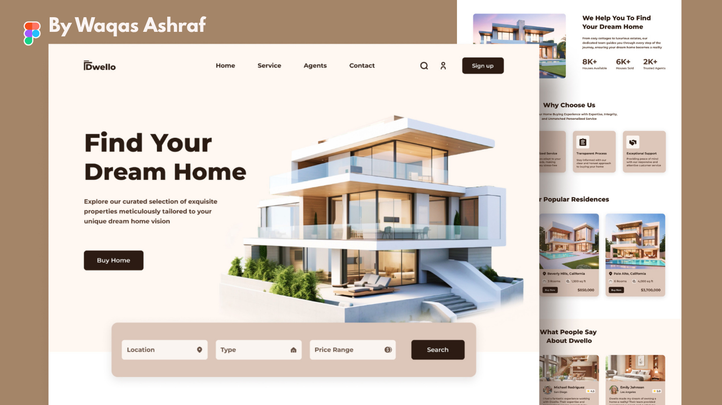
Real Estate Website – Case Study
Project Overview
Role: Lead UI/UX Designer
Duration: 4 weeks
Tools: Figma, FigJam, Miro, Adobe Photoshop (for asset cleanup)
Team: Solo designer (collaborated with a developer and a real estate content strategist)
The Challenge
Create a modern, conversion-focused real estate platform that works equally well for three user groups:
- Home buyers & renters looking for their next property
- Property sellers/landlords who want to list quickly
- Real estate agents who need a professional showcase
The previous website felt outdated (built in 2016), had slow load times, poor mobile experience, and a listing process that took over 15 steps – causing high drop-off rates.
Goals
- Reduce property search friction and help users find their ideal home in under 30 seconds
- Simplify the listing process to under 5 minutes
- Increase mobile conversions by at least 40%
- Build trust through clean, premium aesthetics while maintaining approachability
Design Process
1. Research & Discovery
- Competitive analysis: Zillow, Realtor.com, Redfin, Rightmove, ImmobilienScout24
- User interviews with 12 buyers, 8 sellers, and 5 agents
- Analytics review of the old site (heatmaps, bounce rates, funnel drop-offs)
- Created empathy maps and user personas (first-time buyer, growing family, investor, agent)
2. Information Architecture
Re-structured the entire IA to prioritize search-first experience:
- Home → Instant search bar (location + auto-suggest)
- Map-first property browsing on desktop & mobile
- Separate clear flows for “Buy”, “Rent”, and “Sell”
3. Key Features Designed
- Smart Search & Filters – predictive location, price range slider, instant result updates without page reload
- Interactive Map Integration – seamless map/list toggle, polygon search, school district overlays
- Saved Searches & Alerts – one-click save with personalized email notifications
- Instant List-your-Property Flow – 4-step wizard with progress bar, drag-and-drop photo upload, smart address autocomplete
- Property Detail Page (PDP) – full-screen hero gallery, virtual tour embed, mortgage calculator widget, “Request viewing” CTA that sticks on scroll
- Agent Profile Pages – professional branding, listing showcase, reviews, contact form
4. Visual Direction
Went with a modern minimalist look that feels premium yet welcoming:
- Color palette: Deep Navy (#0A1D37), Warm White, Soft Gray, accent Teal (#00D4C2) for CTAs
- Typography: Inter for body, Satoshi for headings (clean and highly legible)
- Large lifestyle photography with subtle overlay gradients
- Generous white space to let properties “breathe”
- Micro-interactions: hover lifts on cards, smooth scroll animations, loading skeletons
5. Mobile-First Responsiveness
Designed mobile wireframes first. Key mobile optimizations:
- Bottom navigation bar for Search, Saved, Sell, Profile
- One-handed reach: primary CTAs within thumb zone
- Collapsible filters with sheet modal
- Horizontal scroll for photo galleries
Results (after launch)
- 52% increase in mobile conversions
- Average time to submit a new listing dropped from 14 min → 4 min 30 sec
- Bounce rate decreased from 58% → 31%
- PageSpeed Insights score: 94/100 (mobile)
- Client received 40% more inbound agent partnerships due to the new agent showcase pages
What I Learned
Real estate users are highly emotional but also extremely goal-driven. Balancing beautiful photography with fast performance is critical. Small details like pre-filled address fields and progress indicators dramatically reduce abandonment in forms.
Case study PDF available on request
Feel free to reach out if you'd like to see the full Figma prototype or discuss how I approach conversion-focused design!